Colour Palette
Our colour palette plays a vital role in delivering a visibly consistent look to all of our communications. Green is our primary colour as it reflects the natural beauty of our green campus.
Our colour palette
Our primary colour palette has been carefully chosen to identify and differentiate us.
Green is our primary colour (Energy Pantone 368 and Heritage Pantone 349).
- Heritage
-
- #006938
- 0, 105, 56
- 90, 32, 93, 24
- Pantone 349
- Energy
-
- #77BF22
- 119, 191, 34
- 60, 0, 100, 0
- Pantone 368
Colour weightings
- Tertiary Colour
-
- #c5bfb7
- 197, 191, 183
- 26, 22, 27, 3
- Pantone 400
- Tertiary Colour
-
- #827f77
- 130, 127, 119
- 0, 0, 0, 61
- Pantone 424
- Tertiary Colour
-
- #3a3c39
- 58, 60, 57
- 68, 56, 59, 63
- Pantone 447
Our primary colours should be supported by the secondary palette.
Our tertiary colours should be used for body text and some messaging.
The primary and secondary colour palettes are made up of colour pairings - ‘Energy colours’ and ‘Heritage colours’. These can be used separately, mixed or as the pairings suggested.
You can use tints (70%, 50%, 30%) of your chosen colour. Using tints gives more flexibility.
Online colour usage
You should always be mindful of issues of legibility when using the palette and avoid using white text on light colours and black text on dark colours.
To adhere to accessibility guidance online, please ensure that sufficient contrast levels exist between colour usage.
Please use this link to access the digital contract check tool: webaim.org/resources/contrastchecker
Secondary colour palette
To create rhythm, pace and variety we have developed a secondary colour palette. It should be used to support our primary and tertiary palettes with a 90% colour weighting.
- Heritage Teal
-
- #005e63
- 0, 94, 99
- 100, 33, 51, 31
- Pantone 323
- Heritage Yellow
-
- #ecaa00
- 236, 170, 0
- 7, 36, 100, 1
- Pantone 124
- Heritage Orange
-
- #e14504
- 225, 69, 4
- 4, 83, 100, 1
- Pantone 1665
- Heritage Blue
-
- #385dae
- 56, 93, 174
- 85, 64, 0, 0
- Pantone 7455
- Heritage Navy
-
- #14315e
- 20, 49, 94
- 100, 80, 25, 35
- Pantone 540
- Heritage Berry
-
- #9d1e65
- 157, 30, 101
- 34, 94, 22, 10
- Pantone 7648
- Heritage Purple
-
- #31006f
- 49, 0, 111
- 89, 100, 23, 16
- Pantone 2685
- Heritage Gold
-
- 30, 35, 75, 22
- Pantone 871
- This should only be use for printed materials. Pantone 871 is our preference and should be used if possible.
- Energy Teal
-
- #008996
- 0, 137, 150
- 100, 312, 41, 4
- Pantone 321
- Energy Turq
-
- #00A5AC
- 0, 165, 172
- 88, 2, 35, 0
- Pantone 7466
- Energy Yellow
-
- #f4c400
- 244, 196, 0
- 6, 22, 100, 0
- Pantone 7406
- Energy Orange
-
- #FF6D00
- 255, 109, 0
- 0, 76, 100, 0
- Pantone 1505
- Energy Sky
-
- #5fb4e5
- 95, 180, 229
- 62, 13, 1, 0
- Pantone 2915
- Energy Blue
-
- #3d7dca
- 61, 125, 202
- 77, 46, 0, 0
- Pantone 660
- Energy Pink
-
- #E80068
- 232, 0, 104
- 0, 100, 31, 0
- Pantone Rubine
- Energy Purple
-
- #592c82
- 89, 44, 130
- 81, 96, 4, 1
- Pantone 268
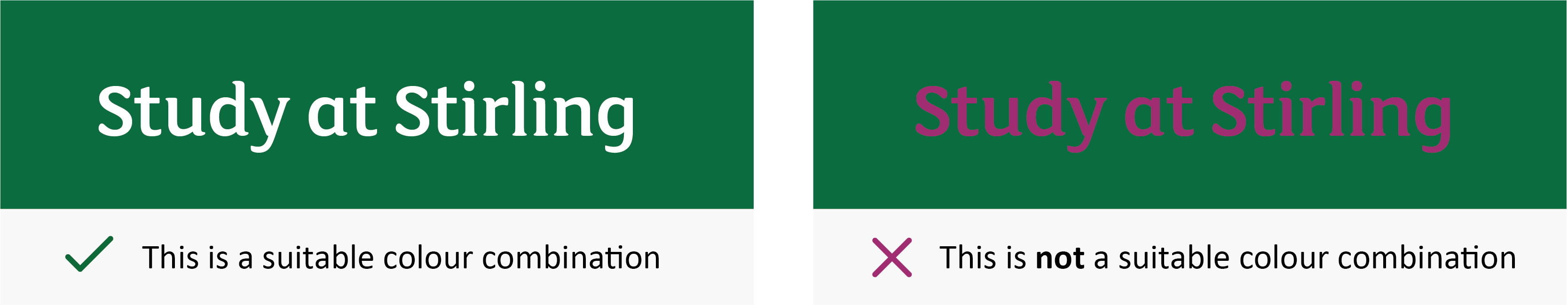
Colour Accessibility
Although our extensive colour palette provides with you many potential colour combinations, you must ensure that text is clearly legible and accessible so please select colours carefully.
For instance, white text on a Heritage Green background works well – whereas Heritage Berry text on a Heritage Green background is very difficult to read (see examples below).